Chapter 04 Graphs and Charts for Business Data
Introduction
In the previous chapter, you were introduced to the basic features of spreadsheet and use of spreadsheet in accounting. Quite often, we have to present the data for communication of the accounting information. If mass of data is presented in the raw form, it may not be easily understandable. It is rightly said, “A picture is worth more than thousand words”. This chapter seeks to explain the method of preparing graphs, charts and diagrams showing the data through the use of Excel as a tool.
4.1 GRAPHS AND CHARTS
A graph is a pictorial representation of data, which has at least 2 dimensional relationship. Therefore, a graph has at least two axes, $\mathrm{X}$ and $\mathrm{Y}$. $\mathrm{X}$-axis is usually horizontal while Y-axis is vertical. A graph may either be a singleline graph or a multipleline graph. For ease and enhancing of clarity, different types of lines and different shades of Colours can be used for preparing a multiple-line graph.
A pie chart represents multiple sub-groups of single variable. A bar diagram depicts two or more variables.

Figure 4.1: Various types of graph and charts
Figure 4.1 shows different types of graphs and charts which can be prepared with the help of the commands or standard tools given in toolbar.
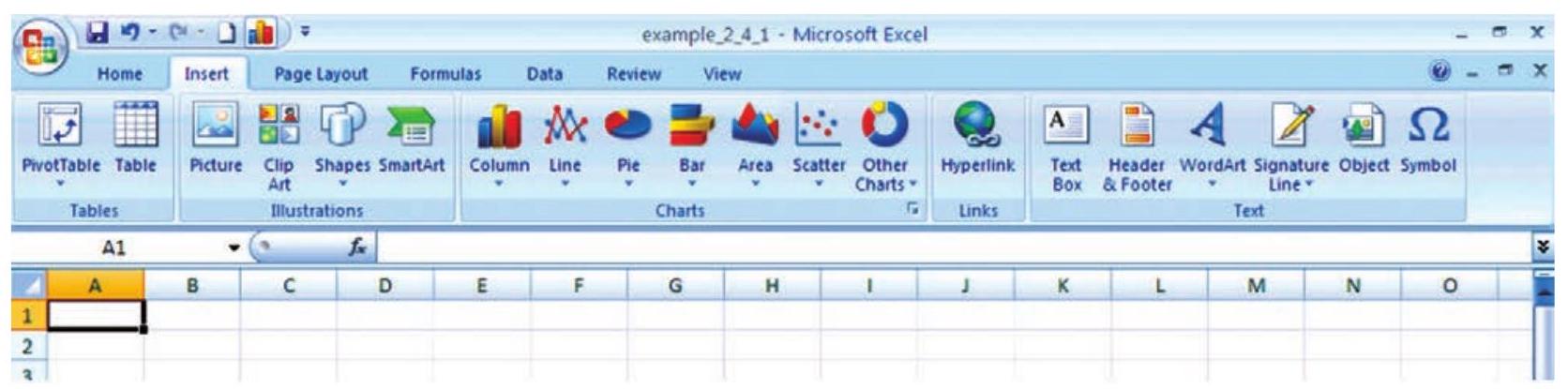
Figure 4.2: Tools for various types of graphs
Using the MS Excel 2007 we can create a basic chart by clicking the chart type that we want on the Microsoft Office Fluent user interface Ribbon, as shown in Figure 4.2. Remember these following steps which are already explained in previous chapter.
1. On the screen of the computer mouse click on Start Icon
2. On clicking of Start symbol we will get Programs option; which will provide us access to a list of programs installed on the computer.
3. On selecting MS Excel 2007 program it will provide a blank workbook with a Ribbon displayed at the top as shown in Figure 4.2.
4. Click on Insert tab to get tools for chart as shown in Figure 4.3.
Figure 4.3 Tools for various types of graphs
We will learn how to draw graphs, charts and diagrams for the following worksheet data see Figure 4.4.
Using the following two steps we can create any type of chart / graph that displays the details that we want.
4.2 BASICS STEPS FOR GRAPHS/CHARTS/ DIAGRAMS USING EXCEL
Step - 1
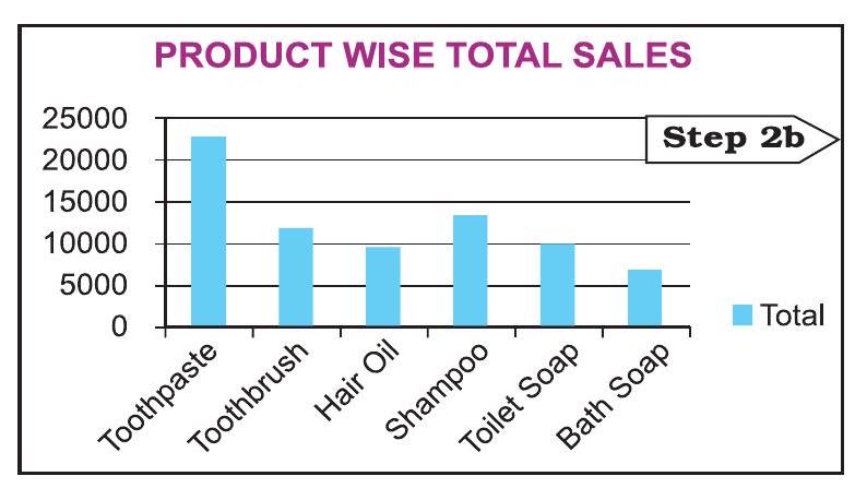
To create a chart in Excel; we will enter sales related data for each quarter sales (namely QTR1 to QTR4) of the year 2007-08 for six different products manufactured by ABC Manufacturing Company Ltd. (as given in Figure 4.4)

Figure 4.4 Quarterly Sales of Product
The row totals (row number 11) gives the quarter wise total sales of products and the column totals (column number G) gives product wise total sales. The cell G11 gives over all total sales of the products for the year are entered in a worksheet.
Step - 2a
In this step we will select to plot the data Product wise Total sales (see in Figure 4.4 and independently shown as Step 2a) into a chart by selecting the chart type that we want to use from the Ribbon. The steps are also described earlier in section 4.1 (use Insert tab and click on Charts group). Let us draw the Bar Chart for the data of step - 2 a.

Step - 2b
To draw a chart/graph for the given data by Excel the above steps are essential and important. From the tab on the ribbon we can see that Excel supports many types of charts to display data in meaningful ways.
| Period | Total Sales |
|---|---|
| Qtr1 | 25844 |
| Qtr2 | 11295 |
| Qtr3 | 14744 |
| Qtr4 | 21886 |
| Total | $\mathbf{7 3 7 6 9}$ |
Let us prepare a new chart from the same worksheet to display total sales for each quarter. The data in the worksheet is to be reorganised for the purpose of chart preparation and as mentioned above, graph/chart will be prepared in similar two steps as described above (Figure 4.5).
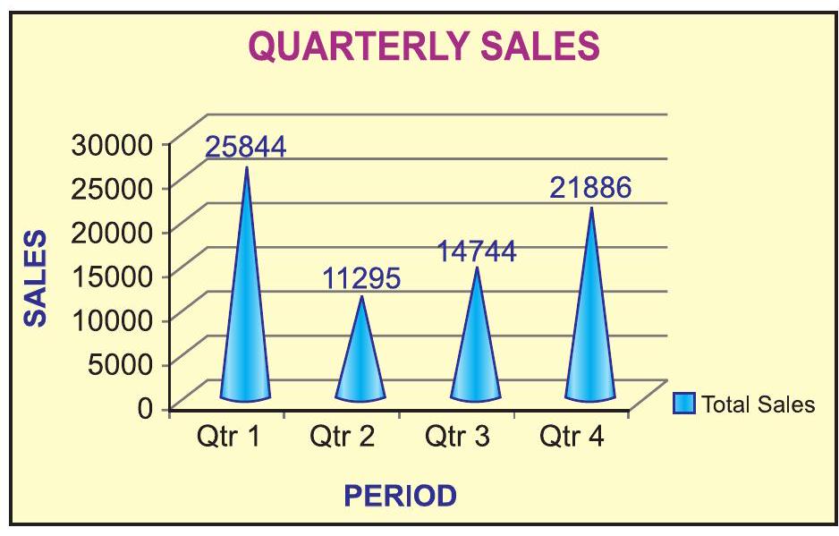
Figure 4.5
To create a chart or to change an existing chart, we select variety of chart types (such as a column chart or pie chart) and their sub-types (such as a stacked column chart or a pie in 3-D chart) from the ribbon. We can also create a combination of chart by using more than one chart type in any chart. This could be possible once we understand the elements of the chart and the formatting of the chart.
4.2.1 ELEMENTS OF A CHART/GRAPH
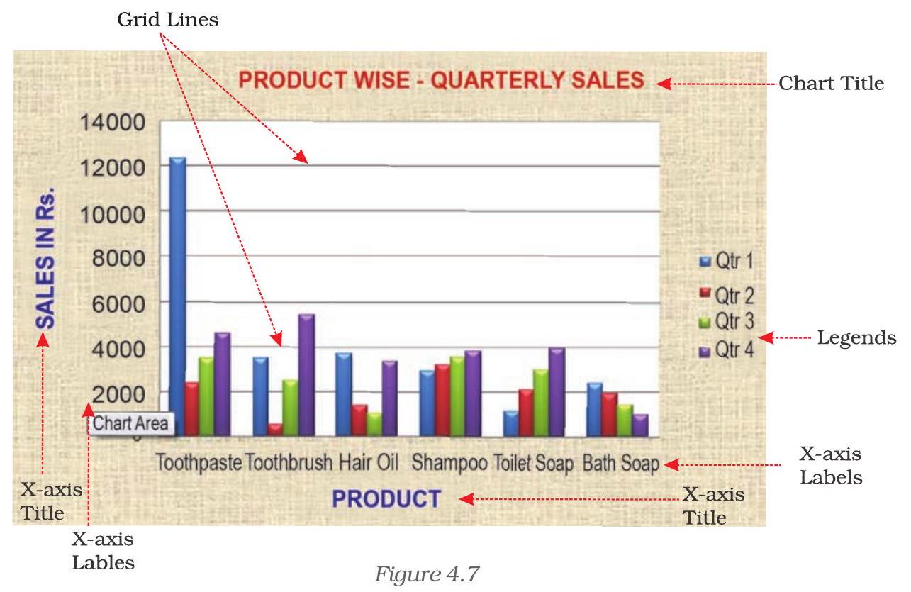
A chart/graph are a pictorial presentation of data. To understand and explain the chart/graph we will learn all basic elements of the chart. These chart/graph elements are given in Figures 4.6 and 4.7.
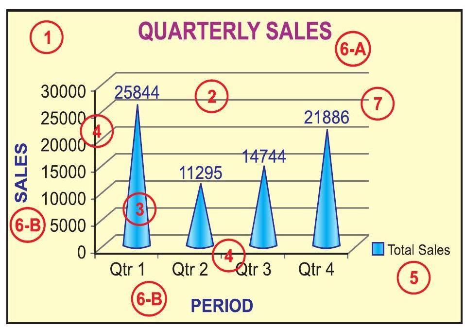
Figure 4.6
1. The chart area: The entire chart including all elements.
2. The plot area: In a $2-D$ chart, the area is bounded by the $\mathrm{X}$ and $\mathrm{Y}$ axes. In a 3-D chart, the area is bounded by the three (X, Y and Z) axes.
3. The data points: Individual values plotted in a chart and represented by bars, columns, lines, pie or various other shapes are called data markers. Data markers of the same colour constitute a data series. The data series are related data points that are plotted in the chart/ graph. Each data series in a chart is shown in a unique colour or pattern or both. Its identification is given by the legend. There may be more than one data series in a chart/graph.
4. The horizontal (category) and vertical (value) axis: The $x$-axis is usually the horizontal line which contains categories (independent values or categories) and y-axis is usually the verticals which contains data (dependent values).
5. The legend: It is an identifier of a piece of information shown in the chart/graph. The legends are assigned to the data series or different categories in a chart (Figure 4.7).
6. A chart and axes titles: Descriptive text for chart title (6-A) and axis title (6-B) as shown in Figure 4.6.
7. A data label: This provides additional information about a data marker to identify the details of data point in a data series.
Some of the elements are displayed by default when we prepare the chart/graph; others can be added as needed. It is also possible to change the format or display of the chart/graph as desired.
4.2.2 FORMATTING OF CHART
4.2.2.1 FORMATTING THE CHART (USING DESIGN OPTION)
As referred in earlier section 4.2.1 above; in this section we will learn titles, labels, legends and gridline as shown in Figure 4.7 can be formatted and edited as per the requirement. Click anywhere in the chart. This will display the Chart Tools, adding the Design, Layout, and Format tabs (Figure 4.8a).
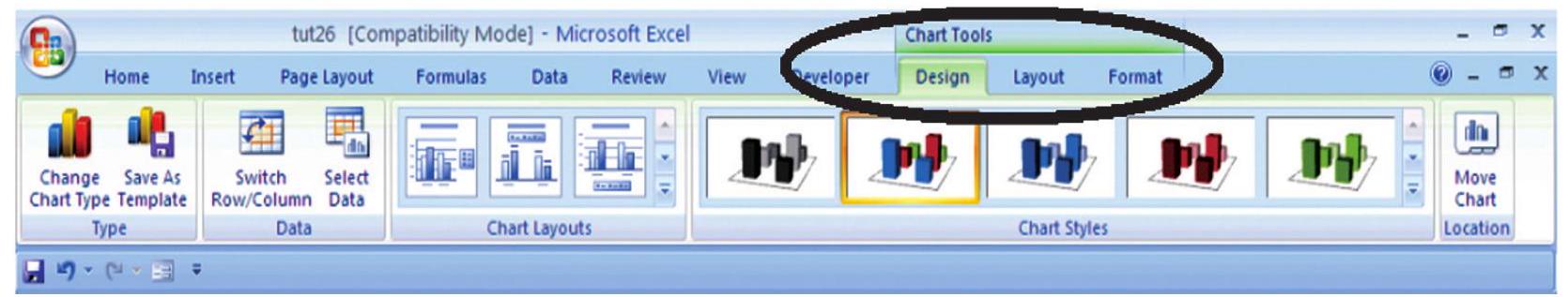
Figure 4.8 (a)
Using Design option we can change the look of a chart. In the Design dialog box, we can click to change chart type, chart layouts and chart styles. One of the options provide for 2-d chart to swap the column data to row data and row data to column data. The steps are as follows:
In a chart (Figure 4.7) click the chart element to change, or do the following to select the chart element from a list of chart elements:
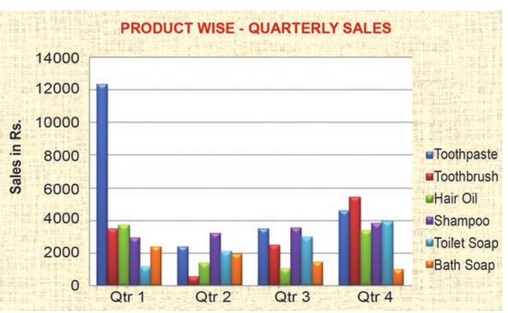
Figure 4.8 (b)
1. Click anywhere in the chart (Figure 4.7). This will display the Chart Tools, adding the Design, Layout, and Format tabs.
2. On the Design tab, in the Data group, click the arrow at the Switch Row/Column box.
3. This will swap the chart/ graph from $\mathrm{X}$-axis (Product) to $\mathrm{X}$-axis (Quarterly)(Figure 4.8(b).
4.2.2.2 Changing the format of a selected chart element
In the same chart, click the chart element to change, or do the following to select the chart element from a list of chart elements:
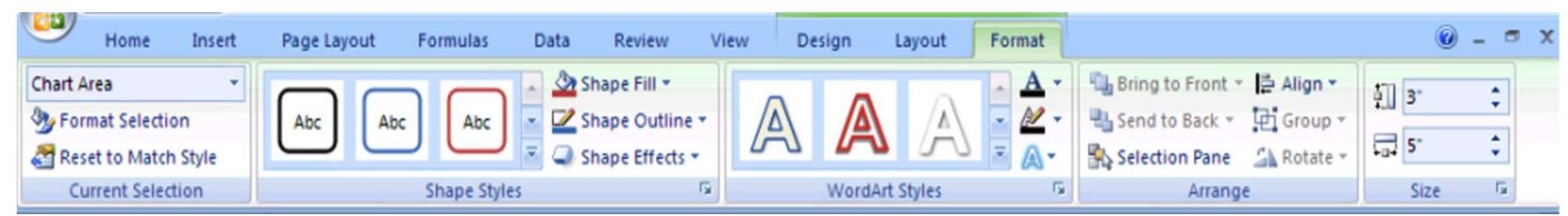
Figure 4.8 (c)
1. Click anywhere in the chart. This will display the Chart Tools, adding the Design, Layout, and Format tabs (Figure 4.8(c).
2. On the Format tab, in the Current Selection group, click the arrow next to the Chart Elements box, and then select the chart element which requires to format.
3. On the Format tab, in the Current Selection group, click the Format Selection (Figure 4.8(d)).
4. In the Format

Figure 4.8 (d)
Changing the shape style
1. On the Format tab, in the Shape Styles group, do one of the following:
- To see all available shape styles, click the More button.
- To apply a pre- defined shape style, in the shape style box, click the style that we want.
- To apply a different shape fill, click Shape Fill, and then do one of the following: (Figure 4.8(e))
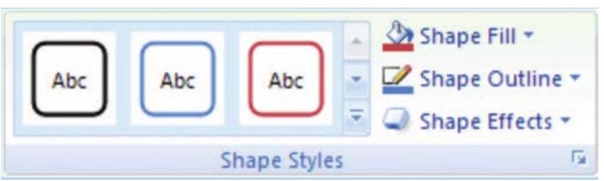
Figure 4.8 (e)
- To use a different fill Colour, under Theme Colours or Standard Colours, left click the select Colour.
- To remove the Colour from the selected chart element, click No Fill.
- To use a fill Colour that is not available under Theme Colours or Standard Colours click More Fill Colours. In the Colours dialog box, specify the Colour that we want to use on the Standard or Custom tab, and then click OK. Custom fill Colours are added under Recent Colours can also be used.
- To fill the shape with a picture, click Picture. In the Insert Picture dialog box, click the picture to use, and then click Insert.
- To use a gradient effect for the selected fill Colour, click Gradient, and then under Variations, click the gradient style to be used. For additional gradient styles, click More Gradients, and then in the Fill category, click the gradient options that to use.
- To use a texture fill, click Texture, and then click the texture to use.
Changing the Shape Outline
- To apply a different shape outline, click Shape Outline, and then do one of the following:
- To use a different outline Colour, under Theme Colours or Standard Colours, click the Colour to use.
- To remove the outline Colour from the selected chart element, click No Outline. If the selected element is a line, the line will no longer be visible on the chart.
- To use an outline Colour that is not available under Theme Colours or Standard Colours click More Outline Colours. In the Colours dialog box, specify the Colour that to use on the Standard or Custom tab, and then click OK. Custom outline Colours are added under Recent Colours can be used again.
- To change the weight (thickness) of a line or border, click Weight option, and then select the line that we wish to use. For additional line style or border style options, click on More Lines, and then click the line style or border style options.
- To use broken line (dash-dash) or border, click Dashes, and then click the dash type to use. For additional dash-type options, click on More Lines, and then click the selected dash.
- To add arrows to lines, click Arrows, and then click the arrow style for borders cannot be used. For additional arrow style or border style options, click More Arrows, and then click the arrow setting.
To apply a different shape effect, click Shape Effects, click an chosen effect, and then select the type of effect.
The shape effects depend on the chart element that we select such as Pre-set, reflection, and bevel. The shape effects are not available for all chart elements.
Changing the text format
To format the text in chart elements, we can use regular text formatting options, or we can apply a WordArt format.
1. Click the chart element that contains the text to format.
2. Right-click the text or select the text to format, and then do one of the following:
- Click the formatting options that we want on the Mini toolbar.
- On the Home tab, in the Font group, click the formatting buttons that we want to use.
To use WordArt styles to format text use chart elements in the following steps: (Figure 4.8(f))
Figure 4.8(f)
1. In a chart, click the chart element that contains the text to be changed, or do the following to select the chart element from a list of chart elements:
2. Click anywhere in the chart.
3. This displays the Chart Tools, adding the Design, Layout, and Format tabs.
4. On the Format tab, in the Current Selection group, click the arrow next to the Chart Elements box, and then select the chart element that to format.
5. On the Format tab, in the WordArt Styles group, do one of the following: (Figure 4.8 (g))
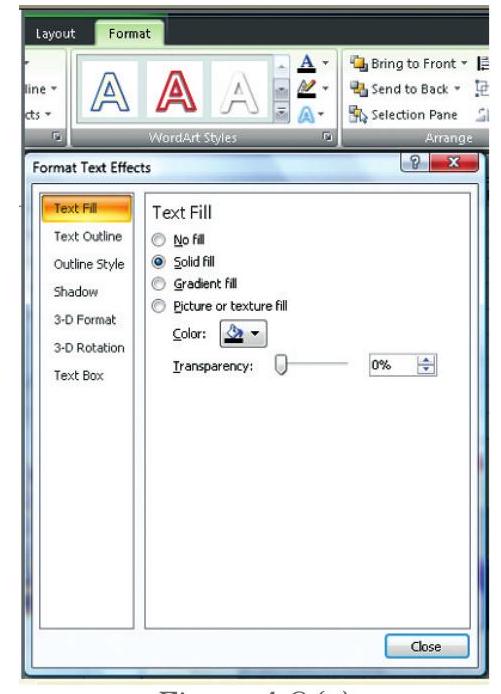
Figure 4.8(g)
- To see all available WordArt styles, click the More button.
We get options for Text related formatting
- Text Fill
- Text Outline
- Shadow
- 3-D Format
- 3-D Rotation
- Text Box
4.2.2.3 CHANGING THE LAYOUT OF THE CHART ELEMENT
In the same chart, click the chart element to change, or do the following to select the chart element from a list of chart elements:
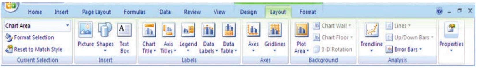
Figure 4.8 (h)
1. On the Layout tab, we can insert different Clip Arts, Picture, data labels, grids etc.
2. In the Format
4.2.3 CHANGE THE CHART TYPE
A chart can be changed to another type of chart to get different look and purpose. For example, the chart shown in Figure 4.5 can be changed to Pie a chart (Figure 4.9) by using the chart tool as given on the Ribbon interface and in Figure 4.2. The every Pie of the chart represents the size of total sales in each quarter proportionately and whole Pie chart displays sum of all the Pies equals to $100 %$.
This is the easiest method to change from column chart or bar chart to Pie chart because
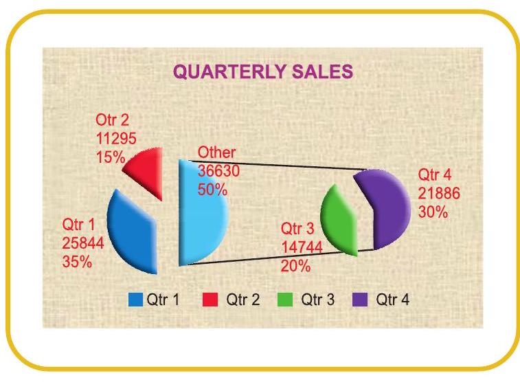
Figure 4.9
- Only one data series is used to plot.
- The plotted data values are positive.
- The data values are not equal to zero also.

Note that in Excel software Pie chart cannot plot more than seven catgories. The categories represent the parts of whole Pie.
Steps for creating a Pie Chart
1. Enter the data in a worksheet.
2. Select the data from two (consecutive) columns only.
3. Select the chart type Pie from the ribbon.
4. Under Pie types select 3-D Pie option
5. Click the plot are of Pie chart this displays the Chart Tools, adding the Design, Layout, and Format tabs.
6. On the Design tab, in the Chart Layouts group, select the layout to use.
7. On the Design tab, in the Chart Styles group, click the chart style.
8. On the Format tab, in the Shape Styles group, click Shape Effects, and then click Bevel.
9. Click 3-D Options, and then under Bevel, click the Top and Bottom bevel options.
10. In the Width and Height boxes for Top and Bottom bevel options, type the point size.
11. Under Surface, click Material, and then click the material option.
12. Click Close.
13. On the Format tab, in the Shape Styles group, click Shape Effects, and then click Shadow.
14. Under Outer, Inner, or Perspective, click the shadow option.
15. To rotate the chart for a better perspective, select the plot area, and then on the Format tab in the Current Selection group, click Format Selection.
16. Under Angle of first slice, drag the slider to the degree of rotation that you want, or type a value between 0 (zero) and 360 to specify the angle of the first slice to appear, and then click Close.
17. Click the chart area of the chart.
18. On the Format tab, in the Shape Styles group, click Shape Effects, and then click Bevel.
19. Under Bevel, select the bevel option.
20. To use theme colors that are different from the default theme that is applied the workbook, do the following:
a. On the Page Layout tab, in the Themes group, click Themes.
b. Under Built-in, click the theme to use.
4.2.4 RESIZING OF CHART/GRAPH
Resizing of the chart means changing size of the chart as desired. This option can be used independently for the fonts, title, legends easily. The first step is to select the chart by clicking the left button of the mouse. Move the cursor on the corners or middle of the borders of the chart/graph which will provide the figure (the cursor will take the shape of a two headed arrow). By pressing the left button and drag/ pull as desired to resize the chart as shown by the red circle in the Figure 4.9a.
4.2.5 2D - 3D CHARTS/GRAPHS
To create graphs we use data which are plotted in two dimensional (2D) format ( $\mathrm{X}$ - axis and Y-axis) as shown in the Figure 4.7. Where as
- Horizontal dimension is X-axis(contains categories)
- Vertical dimension is Y-axis(contains data)
When we plot the data on 2-D type of graph; the known value goes on the $\mathrm{X}$-axis (independent) and derived (dependent variable) value on Y-axis. For example monthly demand of products (in Rs.); then on $\mathrm{X}$-axis we will put Month and on $\mathrm{Y}$-axis we will put the data values for demand.
In the graph sometimes we have to present negative values also, which can be put on the opposite side of the axes from origin (Figure 4.10). The intersection of both the axes (X-axis and $\mathrm{Y}$-axis) is called the origin $(\mathrm{O})$ of the graph. We can put on the right side of the origin positive values and on left side of the origin negative values of data on X-axis. Similarly upper ward side of origin shows positive values and down ward side of the origin shows negative values of data $\mathrm{Y}$-axis. For example, if we have data about monthly profit and loss to be plotted on graph; here profit will be positive data values and loss will have negative data values.
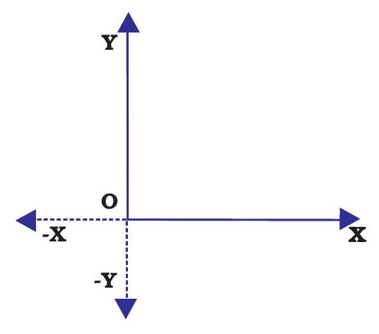
Figure 4.10
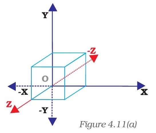
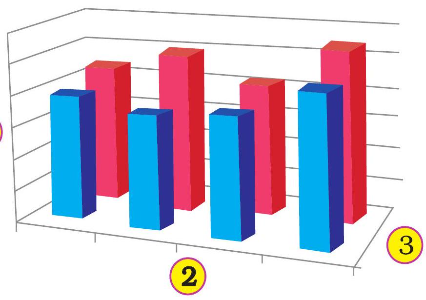
Figure 4.11(b)
2-D types of graphs/charts are line graphs, bar, area, surface column (horizontal or vertical), multiple line charts, radar chart, XY (scatter) or bubble chart.
The 2-D Charts typically have two axes (axis: A line bordering the chart plot area used as a frame of reference for measurement. The $\mathrm{Y}$ axis is usually the vertical axis and contains data. The $\mathrm{X}$-axis is usually the horizontal axis and contains categories.) that are used to measure and categorise data: a vertical axis (also known as derived value axis or $\mathrm{Y}$ axis), and a horizontal axis (also known as category axis or $\mathrm{X}$ axis).
Sometimes graphs/charts can be prepared with three dimensional (3-D) effects. 3-D charts have a third axis, the depth axis (also known as series axis or $\mathrm{Z}$ axis), so that data can be plotted along the depth of a chart. In this type the third dimension is represented by Z-axis (Figure 4.11 (a) & (b)).
For example to represent the volume we require three parameters height (Y-axis), length (X-axis) and breadth (Z-axis).
1. Vertical (derived value) axis (Y-axis).
2. Horizontal (category) axis (X-axis).
3. Depth (series) axis - (Z-axis).
$ \begin{array}{|l|r|r|} \hline \text { Product } & \text { Lowest } & \text { Highest } \\ \hline \hline \text { Toothpaste } & 2345 & 12344 \\ \hline \text { Toothbrush } & 500 & 5415 \\ \hline \text { Hair Oil } & 988 & 3678 \\ \hline \text { Shampoo } & 2900 & 3770 \\ \hline \text { Toilet Soap } & 1122 & 3861 \\ \hline \text { Bath Soap } & 952 & 2344 \\ \hline \text { Total } & \mathbf{8 8 0 7} & \mathbf{3 1 4 1 2} \\ \hline \end{array} $
Sometime we would like to draw the charts for comparison of values. Data that is arranged in columns or rows on a worksheet can be plotted in a radar chart. Radar charts do not have horizontal (category) axes, and similarly pie and doughnut charts do not have any axes. In Figure 4.12 radar chart is drawn for the comparison of highest and lowest values of sales of different products. Radar charts compare the aggregate values of a number of data series (data series: Related data points that are plotted in a chart. Each data series in a chart has a unique color or pattern and is represented in the chart legend. You can plot one or more data series in a chart. Pie charts have only one data series.).
Similarly data can be arranged in columns or rows only on a worksheet and can be plotted in a doughnut chart. Like a pie chart, a doughnut chart shows the relationship of parts to a whole, but it can contain more than one.
Doughnut charts (Figure 4.13) are not easy to read. We may use a stacked column or stacked bar chart instead.
Doughnut charts have the following chart subtypes
Doughnut Doughnut charts display data in rings, where each ring represents a data series. For example, in the previous chart, the inner ring represents gas tax revenues, and the outer ring represents property tax revenues.
Doughnut Chart
Exploded Doughnut Much like exploded pie charts, exploded doughnut charts display the contribution of each value to a total while emphasising individual values, but they can contain more than one data series.
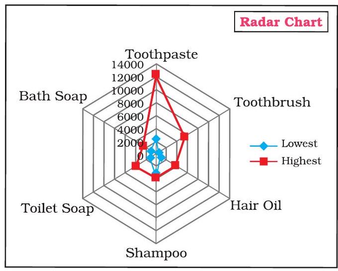
Figure 4.12
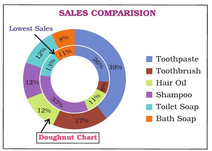
Figure 4.13
4.3 ADVANTAGES IN USING GRAPH/CHART
Help to Explore: Many times we would like to see if there is a relationship between variables. Suppose, that we wanted to determine if there is a relationship between: a country’s GNP and the infant mortality rate, between age and between genders. It may be quicker and easier to create a chart immediately to see the possible relationship of variables to one another, rather than paging through raw data.
Help to Present: We want to provide information in as little time as possible. Graphing plays a key role. It seems that there is no longer any time to sit and read a newspaper in order to find out what is going on. However, newspapers, such as The Economics Times and India Today magazines (which were early users of charting techniques), seem to understand this phenomena and provide graphs to convey and sum up ideas that they are making in their articles.
Help to Convince: The same way that a graph can be used to present and explore different characteristics of data, it can also be used to convince. Graphs have the ability to take large amounts of information and make them into exhibitions that are easily used to persuade.
Summary
-
A graph is a pictorial representation of data. Graphs are usually 2-dimensional. Sometimes 3-dimensional graphs are also used.
-
A graph may be either a singleline graph or a multi-line graph. Multi-line in a graph are distinguished either by using different shapes of line or different shapes and colors.
-
Other popular pictorial representations include Pie Chart and Bar Chart. Pie charts depict relative share of different elements. Bar charts are used to depict the comparison of absolute values of data (e.g. sales, production, etc.) at discrete points (e.g. time intervals, products, etc.).
-
MS-Excel 2007 (or simply Excel) provides a convenient facility to draw graphs and charts. The nomenclature used in Excel for charts (charts include graphs) is as follows:
a. The Chart Area,
b. The Plot Area covering the plot of values in the selected type of chart,
c. The Data Points,
d. The Horizontal (Base Values, e.g. category) and Vertical (Derived Values) Axes,
e. The Legend to specify distinguishing criteria in case of multiple lines, pies, bars, etc.
f. Chart and Axes Titles
g. Data Labels
-
Every elements of a chart - such as plot area, X-axis, Y-axis, data, titles, labels, legends, and gridlines - can be formatted using the Design, Layout and Format dialog box in Excel.
-
Chart’s size can also be changed as per requirements.
-
For multiple visualisations of the same data through different typs of charts, we can change the chart type (say, from line graph to barchart, or bar chart to pie chart, etc) wherever required for better presentation as per the nature of data.
-
Graphs and charts help in easy visualisation of any trends present in data. In highly random data such as stock prices, textual description may not be easily possible to explain the price or other fluctuations, but graphs and charts overcome this constraint as they can be comprehended more easily by human beings.
Following are the steps prepare a chart :
Step - 1: Enter data in a worksheet with proper column and row titles.
Step - 2: Create a basic chart using the pattern from the panel available on top of worksheet in Chart groups’ option.
Step - 3: Change the layout or style of chart.
$\quad$ Apply a predefined chart layout.
$\quad$ Apply a predefined chart style.
$\quad$ Change the layout of chart elements.
$\quad$ Change the format of chart elements.
Step - 4: Add or remove titles or data labels.
$\quad$ Add (Remove) a chart title.
$\quad$ Add (Remove) axis titles.
$\quad$ Link a title to a worksheet cell.
$\quad$ Add (Remove) data labels.
Step - 5: Show or hide a legend.
Step - 6: Display or hide chart axes or gridlines.
$\quad$ Display (hide) primary axes
$\quad$ Display (hide) secondary axes
$\quad$ Display (hide) gridlines
Step - 7: Move (resize) a chart
Step - 8: Save a chart
EXERCISE
Q1. Multiple Choice Questions
1. To change the location of a chart, right-click the chart and select:
a. Chart Type.
b. Source Data.
c. Chart Options.
d. Move here.
2. The Ribbon allows us to:
a. Create either an embedded chart or a chart sheet chart:
b. Create only an embedded chart.
c. Create only a chart sheet chart.
d. Change the data values used to create the chart.
3. Once we have created a chart we may change
a. the formatting for text like titles and data labels.
b. only by going back through the ribbon.
c. everything about the chart.
d. the data series patterns only.
4. In Excel the chart tools provides three different options and ______, ______ and ______ for formatting:
a. Layout, Format, Data Marker.
b. Design, Layout, Format.
c. Chart Layouts, Chart Style, Label.
d. Format, Layout, Label.
5. Pie chart don’t have more than ______ categories:
a. Ten.
b. Twenty Five.
c. Seven.
d. Three.
6. Column charts are useful for _________
a. Showing data changes over a period of time.
b. Illustrating comparisons among items.
c. Both a and b.
d. None of the above.
7. Doughnut charts:
a. Contains more than one data series.
b. Comparable with Pie chart.
c. Both a and b.
d. None of the above.
8. The 2D graph using _____ , _____ axes and in 3D graph _____ axis is also used.
a. Category, value, vertical.
b. Horizontal, vertical, depth.
c. Category, value, series.
d. b and c both.
9. Excel automatically redraws the chart ______:
a. If any change is made in data.
b. If any change is made in the range data.
c. a and b both.
d. None of the above.
10. Legend can be repositioned on the chart:
a. anywhere.
b. on right side only.
c. on the bottom of X-axis.
d. on the corner only.
11. Which chart element details the data values and categories below the chart?
a. Data point.
b. Data labels.
c. Data marker.
d. Data table.
12. From what command tab is the font size for an axis in a chart changed?
a. Home.
b. Insert.
c. Format.
d. Design.
13. Which of these purposes does not pertain to charts?
a. Identifying trends.
b. Selecting values.
c. Recognising patterns.
d. Making comparisons.
14. What do you see if you move over the mouse over a chart object?
a. KeyTip.
b. ScreenTip.
c. ChartTip.
d. ChartKey.
15. Which group on the Chart Tools Format tab shows the name of the selected element?
a. Arrange Objects.
b. Chart Objects.
c. Choose Selection.
d. Current Selection.
Q2. Answer the following Questions
1. Define charts, graphs and how they are useful in business decisions?
2. Write down the usage and purpose of column chart, pie chart and line chart.
3. Describe about data series, legend, and data labels??
4. Describe use of Excel for preparation of chart.
5. Differentiate between pie charts, line charts and column charts respectively?
6. Described the steps to move, resizing and reposition a chart.
7. What does percentage in chart represent and how it being calculated by the software?
8. What are the differences between
a. Area, XY chart and doughnut
b. 2-D Charts and 3-D Charts
9. What is pie chart and what are percentage values means in pie chart?
10. Different types of charts which can be prepared using Excel?
Q3. Skill Review
A. Create a trend chart after filling data in to the worksheet.
(Population of India/State in Millions to be enter)
| Year | Male(1) | Female (2) | Total(3) | |||
|---|---|---|---|---|---|---|
| Literate | Illiterate | Literate | Illiterate | Literate | Illiterate | |
| 2001 | ||||||
| 2002 | ||||||
| 2003 | ||||||
| 2004 | ||||||
| 2005 | ||||||
| 2006 | ||||||
| 2007 | ||||||
| 2008 |
Note: Total Literate $=$ Values of Male Literate + Values of Female Literate
Total Illiterate $=$ Values of Male Illiterate + Values of Female Illiterate
B. Create a Pie chart to compare data from above table for Total (column number 3).
C. Draw a Trend charts for each male, female and totals separately.
D. Draw a Column Chart for the above data for each (male, female and total) separately for Literate and Illiterate.
E. Prepare a Pie chart and Column chart for the 10 different plots areas 5, 7, 8, 9, 8, 10, 4, 6, 7 and 3 hectares respectively.
F. Draw a Pie chart for the following data on vehicles registered in the RTO department during 2007-08 in your city.
| Vehicle Type |
Bus | Trucks | Auto Rixa | Cars | Two Wheelers |
Heavy Vehicles |
|---|---|---|---|---|---|---|
| Number of Vehicles |
575 | 5889 | 12345 | 9765 | 23456 | 65 |
G. Draw a Column chart for the following data.
| Marks | $\mathbf{0 - 2 0}$ | $\mathbf{2 1 - 4 0}$ | $\mathbf{4 1 - 6 0}$ | $\mathbf{6 1 - 8 0}$ | $\mathbf{8 1 - 1 0 0}$ | Total |
|---|---|---|---|---|---|---|
| Number of Students |
113 | 180 | 350 | 232 | 125 | 1000 |