Chapter-12 Statistics
12.1 Graphical Representation of Data
The representation of data by tables has already been discussed. Now let us turn our attention to another representation of data, i.e., the graphical representation. It is well said that one picture is better than a thousand words. Usually comparisons among the individual items are best shown by means of graphs. The representation then becomes easier to understand than the actual data. We shall study the following graphical representations in this section.
(A) Bar graphs
(B) Histograms of uniform width, and of varying widths
(C) Frequency polygons
(A) Bar Graphs
In earlier classes, you have already studied and constructed bar graphs. Here we shall discuss them through a more formal approach. Recall that a bar graph is a pictorial representation of data in which usually bars of uniform width are drawn with equal spacing between them on one axis (say, the $x$-axis), depicting the variable. The values of the variable are shown on the other axis (say, the $y$-axis) and the heights of the bars depend on the values of the variable.
Example 1 : In a particular section of Class IX, 40 students were asked about the months of their birth and the following graph was prepared for the data so obtained:
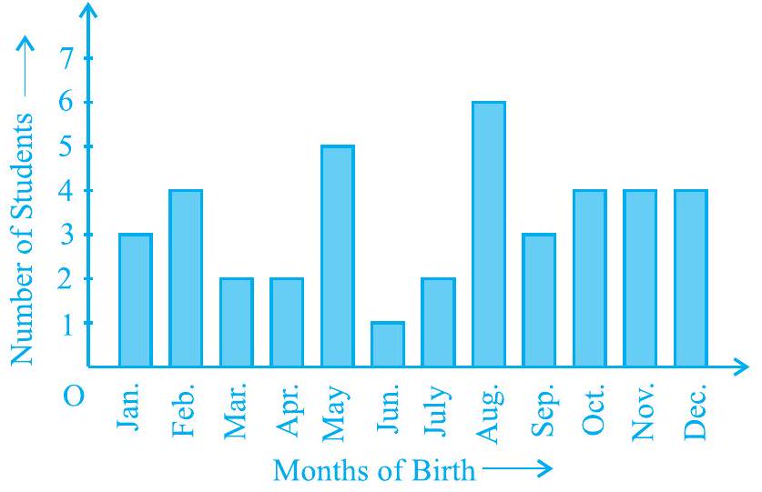
Fig. 12.1
Observe the bar graph given above and answer the following questions:
(i) How many students were born in the month of November?
(ii) In which month were the maximum number of students born?
Solution : Note that the variable here is the ‘month of birth’, and the value of the variable is the ‘Number of students born’.
(i) 4 students were born in the month of November.
(ii) The Maximum number of students were born in the month of August.
Let us now recall how a bar graph is constructed by considering the following example.
Example 2 : A family with a monthly income of ₹ 20,000 had planned the following expenditures per month under various heads:
Table 12.1
| Heads | Expenditure (in thousand rupees) |
|---|---|
| Grocery | 4 |
| Rent | 5 |
| Education of children | 5 |
| Medicine | 2 |
| Fuel | 2 |
| Entertainment | 1 |
| Miscellaneous | 1 |
Draw a bar graph for the data above.
Solution : We draw the bar graph of this data in the following steps. Note that the unit in the second column is thousand rupees. So, ‘4’ against ‘grocery’ means ₹4000.
1. We represent the Heads (variable) on the horizontal axis choosing any scale, since the width of the bar is not important. But for clarity, we take equal widths for all bars and maintain equal gaps in between. Let one Head be represented by one unit.
2. We represent the expenditure (value) on the vertical axis. Since the maximum expenditure is ₹ 5000 , we can choose the scale as 1 unit =₹ 1000.
3. To represent our first Head, i.e., grocery, we draw a rectangular bar with width 1 unit and height 4 units.
4. Similarly, other Heads are represented leaving a gap of 1 unit in between two consecutive bars.
The bar graph is drawn in Fig. 12.2.
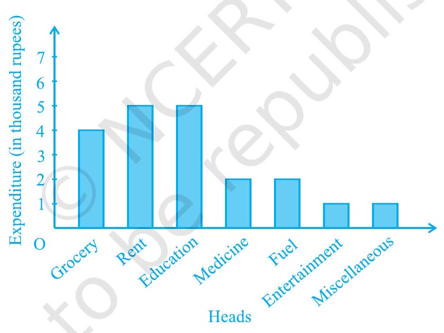
Fig. 12.2
Here, you can easily visualise the relative characteristics of the data at a glance, e.g., the expenditure on education is more than double that of medical expenses. Therefore, in some ways it serves as a better representation of data than the tabular form.
Activity 1 : Continuing with the same four groups of Activity 1, represent the data by suitable bar graphs.
Let us now see how a frequency distribution table for continuous class intervals can be represented graphically.
(B) Histogram
This is a form of representation like the bar graph, but it is used for continuous class intervals. For instance, consider the frequency distribution Table 12.2, representing the weights of 36 students of a class:
Table 12.2
| Weights (in kg) | Number of students |
|---|---|
| $30.5-35.5$ | 9 |
| $35.5-40.5$ | 6 |
| $40.5-45.5$ | 15 |
| $45.5-50.5$ | 3 |
| $50.5-55.5$ | 1 |
| $55.5-60.5$ | 2 |
| Total | 36 |
Let us represent the data given above graphically as follows:
(i) We represent the weights on the horizontal axis on a suitable scale. We can choose the scale as $1 \mathrm{~cm}=5 \mathrm{~kg}$. Also, since the first class interval is starting from 30.5 and not zero, we show it on the graph by marking a kink or a break on the axis.
(ii) We represent the number of students (frequency) on the vertical axis on a suitable scale. Since the maximum frequency is 15 , we need to choose the scale to accomodate this maximum frequency.
(iii) We now draw rectangles (or rectangular bars) of width equal to the class-size and lengths according to the frequencies of the corresponding class intervals. For example, the rectangle for the class interval $30.5-35.5$ will be of width $1 \mathrm{~cm}$ and length $4.5 \mathrm{~cm}$.
(iv) In this way, we obtain the graph as shown in Fig. 12.3:
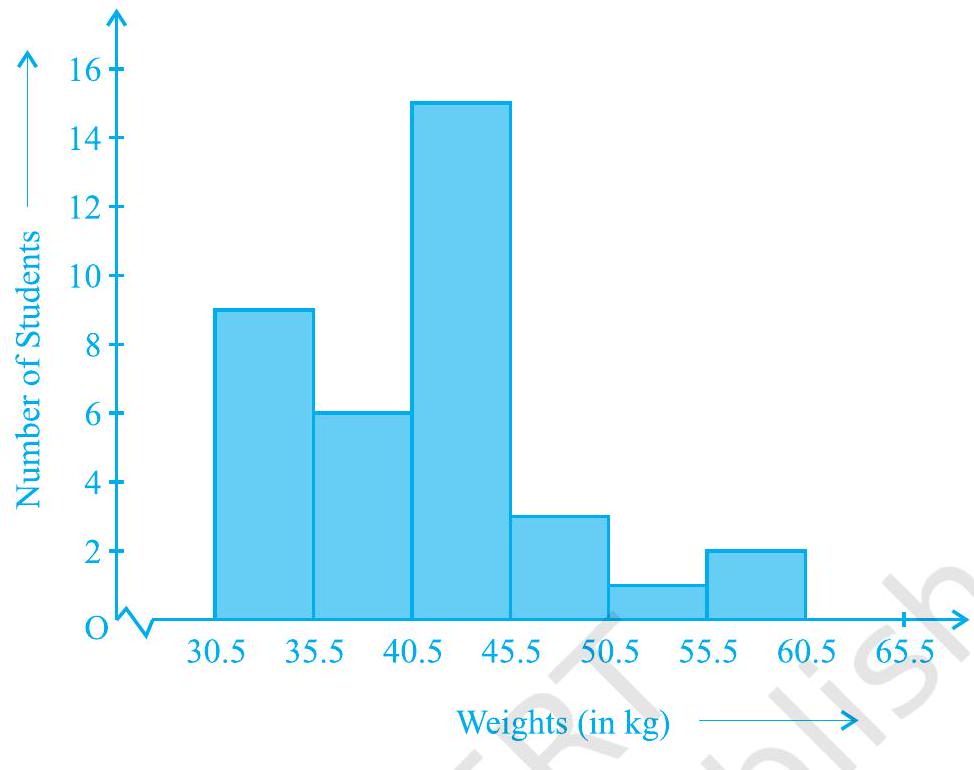
Fig. 12.3
Observe that since there are no gaps in between consecutive rectangles, the resultant graph appears like a solid figure. This is called a histogram, which is a graphical representation of a grouped frequency distribution with continuous classes. Also, unlike a bar graph, the width of the bar plays a significant role in its construction.
Here, in fact, areas of the rectangles erected are proportional to the corresponding frequencies. However, since the widths of the rectangles are all equal, the lengths of the rectangles are proportional to the frequencies. That is why, we draw the lengths according to (iii) above.
Now, consider a situation different from the one above.
Example 3 : A teacher wanted to analyse the performance of two sections of students in a mathematics test of 100 marks. Looking at their performances, she found that a few students got under 20 marks and a few got 70 marks or above. So she decided to group them into intervals of varying sizes as follows: $0-20,20-30, \ldots, 60-70$, 70 - 100. Then she formed the following table:
Table 12.3
| Marks | Number of students |
|---|---|
| $0-20$ | 7 |
| $20-30$ | 10 |
| $30-40$ | 10 |
| $40-50$ | 20 |
| $50-60$ | 20 |
| $60-70$ | 15 |
| $70-$ above | 8 |
| Total | 90 |
A histogram for this table was prepared by a student as shown in Fig. 12.4.
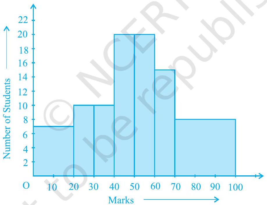
Fig. 12.4
Carefully examine this graphical representation. Do you think that it correctly represents the data? No, the graph is giving us a misleading picture. As we have mentioned earlier, the areas of the rectangles are proportional to the frequencies in a histogram. Earlier this problem did not arise, because the widths of all the rectangles were equal. But here, since the widths of the rectangles are varying, the histogram above does not give a correct picture. For example, it shows a greater frequency in the interval $70-100$, than in $60-70$, which is not the case.
So, we need to make certain modifications in the lengths of the rectangles so that the areas are again proportional to the frequencies.
The steps to be followed are as given below:
- Select a class interval with the minimum class size. In the example above, the minimum class-size is 10 .
- The lengths of the rectangles are then modified to be proportionate to the class-size 10.
For instance, when the class-size is 20 , the length of the rectangle is 7 . So when the class-size is 10 , the length of the rectangle will be $\frac{7}{20} \times 10=3.5$.
Similarly, proceeding in this manner, we get the following table:
Table 12.4
| Marks | Frequency | Width of the class |
Length of the rectangle |
|---|---|---|---|
| $0-20$ | 7 | 20 | $\frac{7}{20} \times 10=3.5$ |
| $20-30$ | 10 | 10 | $\frac{10}{10} \times 10=10$ |
| $30-40$ | 10 | 10 | $\frac{10}{10} \times 10=10$ |
| $40-50$ | 20 | 10 | $\frac{20}{10} \times 10=20$ |
| $50-60$ | 20 | 10 | $\frac{20}{10} \times 10=20$ |
| $60-70$ | 15 | 10 | $\frac{15}{10} \times 10=15$ |
| $70-100$ | 8 | 30 | $\frac{8}{30} \times 10=2.67$ |
Since we have calculated these lengths for an interval of 10 marks in each case, we may call these lengths as “proportion of students per 10 marks interval”.
So, the correct histogram with varying width is given in Fig. 12.5.

Fig. 12.5
(C) Frequency Polygon
There is yet another visual way of representing quantitative data and its frequencies. This is a polygon. To see what we mean, consider the histogram represented by Fig. 12.3. Let us join the mid-points of the upper sides of the adjacent rectangles of this histogram by means of line segments. Let us call these mid-points B, C, D, E, F and G. When joined by line segments, we obtain the figure BCDEFG (see Fig. 12.6). To complete the polygon, we assume that there is a class interval with frequency zero before 30.5 - 35.5, and one after 55.5 - 60.5, and their mid-points are $\mathrm{A}$ and $\mathrm{H}$, respectively. $\mathrm{ABCDEFGH}$ is the frequency polygon corresponding to the data shown in Fig. 12.3. We have shown this in Fig. 12.6.
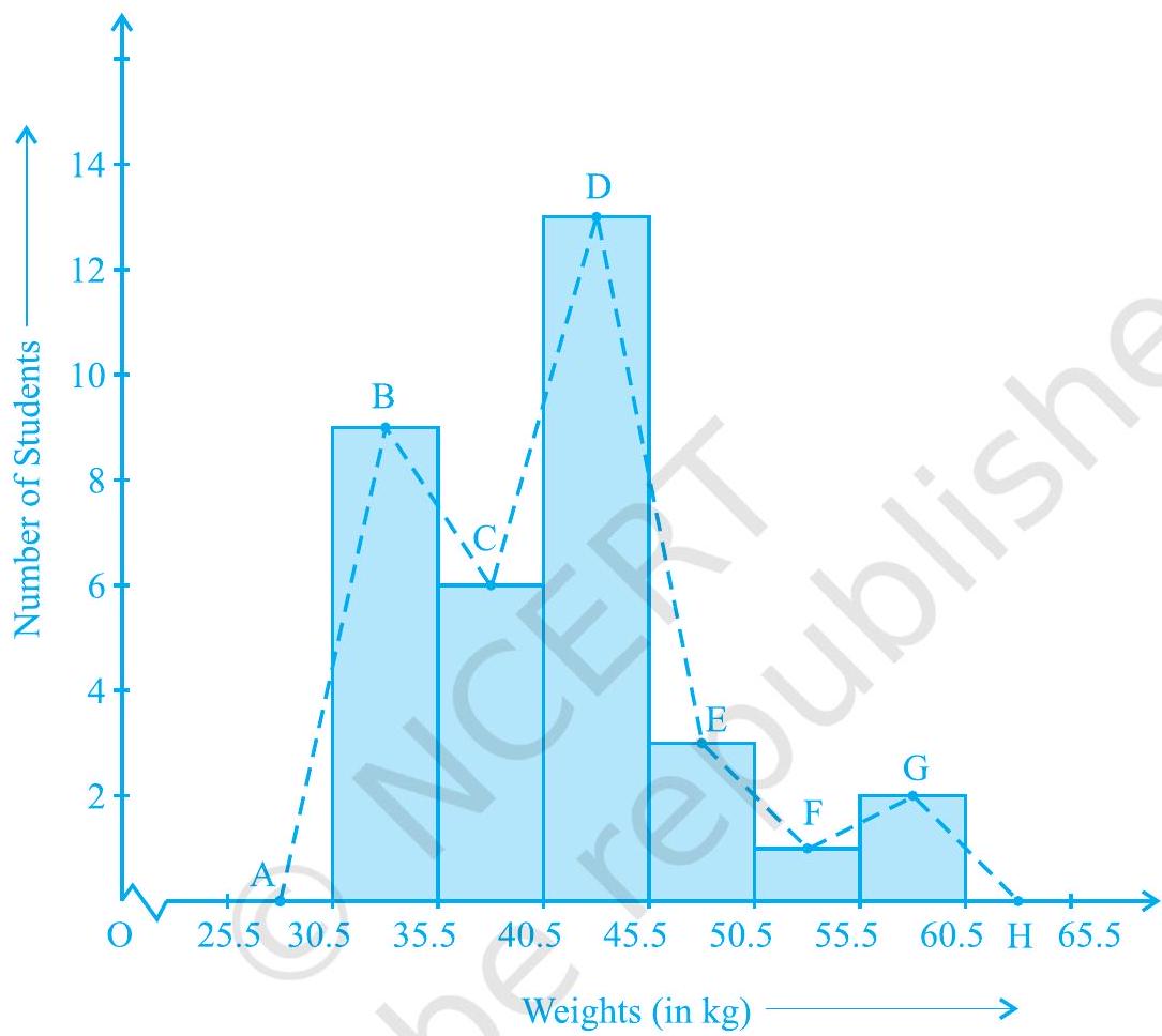
Fig. 12.6
Although, there exists no class preceding the lowest class and no class succeeding the highest class, addition of the two class intervals with zero frequency enables us to make the area of the frequency polygon the same as the area of the histogram. Why is this so? (Hint : Use the properties of congruent triangles.)
Now, the question arises: how do we complete the polygon when there is no class preceding the first class? Let us consider such a situation.
Example 4 : Consider the marks, out of 100, obtained by 51 students of a class in a test, given in Table 12.5.
Table 12.5
| Marks | Number of students |
|---|---|
| $0-10$ | 5 |
| $10-20$ | 10 |
| $20-30$ | 4 |
| $30-40$ | 6 |
| $40-50$ | 7 |
| $50-60$ | 3 |
| $60-70$ | 2 |
| $70-80$ | 2 |
| $80-90$ | 3 |
| $90-100$ | 9 |
| Total | 51 |
Draw a frequency polygon corresponding to this frequency distribution table.
Solution : Let us first draw a histogram for this data and mark the mid-points of the tops of the rectangles as B, C, D, E, F, G, H, I, J, K, respectively. Here, the first class is $0-10$. So, to find the class preceeding $0-10$, we extend the horizontal axis in the negative direction and find the mid-point of the imaginary class-interval $(-10)-0$. The first end point, i.e., $\mathrm{B}$ is joined to this mid-point with zero frequency on the negative direction of the horizontal axis. The point where this line segment meets the vertical axis is marked as $\mathrm{A}$. Let $\mathrm{L}$ be the mid-point of the class succeeding the last class of the given data. Then OABCDEFGHIJKL is the frequency polygon, which is shown in Fig. 12.7.
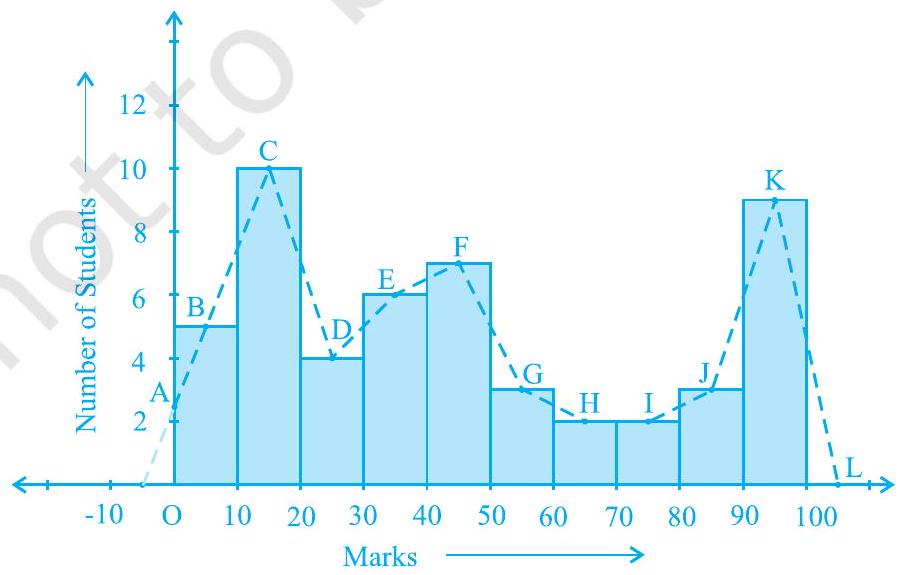
Fig. 12.7
Frequency polygons can also be drawn independently without drawing histograms. For this, we require the mid-points of the class-intervals used in the data. These mid-points of the class-intervals are called class-marks.
To find the class-mark of a class interval, we find the sum of the upper limit and lower limit of a class and divide it by 2 . Thus,
$$ \text { Class-mark }=\frac{\text { Upper limit }+ \text { Lower limit }}{2} $$
Let us consider an example.
Example 5 : In a city, the weekly observations made in a study on the cost of living index are given in the following table:
Table 12.6
| Cost of living index | Number of weeks |
|---|---|
| $140-150$ | 5 |
| $150-160$ | 10 |
| $160-170$ | 20 |
| $170-180$ | 9 |
| $180-190$ | 6 |
| $190-200$ | 2 |
| Total | 52 |
Draw a frequency polygon for the data above (without constructing a histogram).
Solution : Since we want to draw a frequency polygon without a histogram, let us find the class-marks of the classes given above, that is of $140-150,150-160, \ldots$.
For $140-150$, the upper limit $=150$, and the lower limit $=140$
So, the class-mark $=\frac{150+140}{2}=\frac{290}{2}=145$.
Continuing in the same manner, we find the class-marks of the other classes as well. So, the new table obtained is as shown in the following table:
Table 12.7
| Classes | Class-marks | Frequency |
|---|---|---|
| $140-150$ | 145 | 5 |
| $150-160$ | 155 | 10 |
| $160-170$ | 165 | 20 |
| $170-180$ | 175 | 9 |
| $180-190$ | 185 | 6 |
| $190-200$ | 195 | 2 |
| Total | 52 |
We can now draw a frequency polygon by plotting the class-marks along the horizontal axis, the frequencies along the vertical-axis, and then plotting and joining the points $\mathrm{B}(145,5), \mathrm{C}(155,10), \mathrm{D}(165,20), \mathrm{E}(175,9), \mathrm{F}(185,6)$ and $\mathrm{G}(195,2)$ by line segments. We should not forget to plot the point corresponding to the class-mark of the class 130 - 140 (just before the lowest class 140 - 150) with zero frequency, that is, $\mathrm{A}(135,0)$, and the point $\mathrm{H}(205,0)$ occurs immediately after $\mathrm{G}(195,2)$. So, the resultant frequency polygon will be ABCDEFGH (see Fig. 12.8).
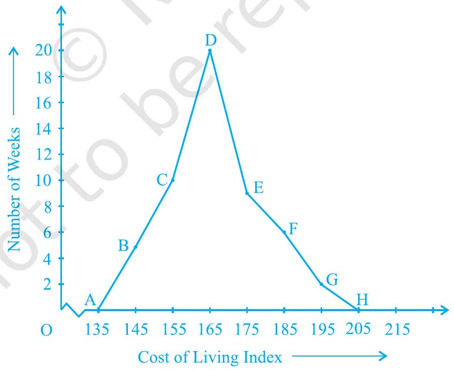
Fig. 12.8
Frequency polygons are used when the data is continuous and very large. It is very useful for comparing two different sets of data of the same nature, for example, comparing the performance of two different sections of the same class.
EXERCISE 12.1
1. A survey conducted by an organisation for the cause of illness and death among the women between the ages 15 - 44 (in years) worldwide, found the following figures (in %):
| S.No. | Causes | Female fatality rate (%) |
|---|---|---|
| 1. | Reproductive health conditions | 31.8 |
| 2. | Neuropsychiatric conditions | 25.4 |
| 3. | Injuries | 12.4 |
| 4. | Cardiovascular conditions | 4.3 |
| 5. | Respiratory conditions | 4.1 |
| 6. | Other causes | 22.0 |
(i) Represent the information given above graphically.
(ii) Which condition is the major cause of women’s ill health and death worldwide?
(iii) Try to find out, with the help of your teacher, any two factors which play a major role in the cause in (ii) above being the major cause.
Show Answer
Solution
(i) The information given in the question is represented below graphically.

Causes
(ii) We can observe from the graph that reproductive health conditions are the major cause of women’s ill health and death worldwide.
(iii) Two factors responsible for the cause in (ii) are
- Lack of proper care and understanding.
- Lack of medical facilities.
2. The following data on the number of girls (to the nearest ten) per thousand boys in different sections of Indian society is given below.
| Section | Number of girls per thousand boys |
|---|---|
| Scheduled Caste (SC) | 940 |
| Scheduled Tribe (ST) | 970 |
| Non SC/ST | 920 |
| Backward districts | 950 |
| Non-backward districts | 920 |
| Rural | 930 |
| Urban | 910 |
(i) Represent the information above by a bar graph.
(ii) In the classroom discuss what conclusions can be arrived at from the graph.
Show Answer
Solution
(i) The information given in the question is represented below graphically.

(ii) From the above graph, we can conclude that the maximum number of girls per thousand boys is present in section ST. We can also observe that the backward districts and rural areas have more girls per thousand boys than nonbackward districts and urban areas.
3. Given below are the seats won by different political parties in the polling outcome of a state assembly elections:
| Political Party | A | B | C | D | E | F |
|---|---|---|---|---|---|---|
| Seats Won | 75 | 55 | 37 | 29 | 10 | 37 |
(i) Draw a bar graph to represent the polling results.
(ii) Which political party won the maximum number of seats?
Show Answer
Solution
(i) The bar graph representing the polling results is given below.

(ii) From the bar graph, it is clear that Party A won the maximum number of seats.
4. The length of 40 leaves of a plant are measured correct to one millimetre, and the obtained data is represented in the following table:
| Length (in mm) | Number of leaves |
|---|---|
| $118-126$ | 3 |
| $127-135$ | 5 |
| $136-144$ | 9 |
| $145-153$ | 12 |
| $154-162$ | 5 |
| $163-171$ | 4 |
| $172-180$ | 2 |
(i) Draw a histogram to represent the given data. [Hint: First make the class intervals continuous]
(ii) Is there any other suitable graphical representation for the same data?
(iii) Is it correct to conclude that the maximum number of leaves are $153 \mathrm{~mm}$ long? Why?
Show Answer
Solution
(i) The data given in the question is represented in the discontinuous class interval. So, we have to make it in the continuous class interval. The difference is 1 , so taking half of 1 , we subtract $1 / 2=0.5$ from the lower limit and add 0.5 to the upper limit. Then, the table becomes
| S.No. | Length (in mm) | Number of leaves |
|---|---|---|
| 1. | $117.5-126.5$ | 3 |
| 2. | $126.5-135.5$ | 5 |
| 3. | $135.5-144.5$ | 9 |
| 4. | $144.5-153.5$ | 12 |
| 5. | $153.5-162.5$ | 5 |
| 6. | $162.5-171.5$ | 4 |
| 7. | $171.5-180.5$ |

(ii) Yes, the data given in the question can also be represented by a frequency polygon.
(iii) No, we cannot conclude that the maximum number of leaves is $153 mm$ long because the maximum number of leaves are lying in-between the length of 144.5 - 153.5
5. The following table gives the life times of 400 neon lamps:
| Life time (in hours) | Number of lamps |
|---|---|
| $300-400$ | 14 |
| $400-500$ | 56 |
| $500-600$ | 60 |
| $600-700$ | 86 |
| $700-800$ | 74 |
| $800-900$ | 62 |
| $900-1000$ | 48 |
(i) Represent the given information with the help of a histogram.
(ii) How many lamps have a life time of more than 700 hours?
Show Answer
Solution
(i) The histogram representation of the given data is given below.

(ii) The number of lamps having a lifetime of more than 700 hours $=74+62+48=184$
6. The following table gives the distribution of students of two sections according to the marks obtained by them:
| Section A | Section B | ||
|---|---|---|---|
| Marks | Frequency | Marks | Frequency |
| $0-10$ | 3 | $0-10$ | 5 |
| $10-20$ | 9 | $10-20$ | 19 |
| $20-30$ | 17 | $20-30$ | 15 |
| $30-40$ | 12 | $30-40$ | 10 |
| $40-50$ | 9 | $40-50$ | 1 |
Represent the marks of the students of both the sections on the same graph by two frequency polygons. From the two polygons compare the performance of the two sections.
Show Answer
Solution
The class-marks $=($ lower limit + upper limit $) / 2$
For section A,
| Marks | Class-marks | Frequency |
|---|---|---|
| $0-10$ | 5 | 3 |
| $10-20$ | 15 | 9 |
| $30-30$ | 25 | 17 |
| $30-40$ | 35 | 12 |
| $40-50$ | 45 | 9 |
For section B,
| Marks | Class-marks | Frequency |
|---|
| $0-10$ | 5 | 5 |
|---|---|---|
| $10-20$ | 15 | 19 |
| $20-30$ | 25 | 15 |
| $30-40$ | 35 | 10 |
| $40-50$ | 45 | 1 |
Representing these data on a graph using two frequency polygon, we get

From the graph, we can conclude that the students of Section A performed better than Section B.
7. The runs scored by two teams A and B on the first 60 balls in a cricket match are given below:
| Number of balls | Team A | Team B |
|---|---|---|
| $1-6$ | 2 | 5 |
| $7-12$ | 1 | 6 |
| $13-18$ | 8 | 2 |
| $19-24$ | 9 | 10 |
| $25-30$ | 4 | 5 |
| $31-36$ | 5 | 6 |
| $37-42$ | 6 | 3 |
| $43-48$ | 10 | 4 |
| $49-54$ | 6 | 8 |
| $55-60$ | 2 | 10 |
Represent the data of both the teams on the same graph by frequency polygons.
[Hint : First make the class intervals continuous.]
Show Answer
Solution
The data given in the question is represented in the discontinuous class interval. So, we have to make it in the continuous class interval. The difference is 1 , so taking half of 1 , we subtract $1 / 2=0.5=0.5$ from the lower limit and add 0.5 to the upper limit. Then, the table becomes
| Number of Balls | Class Mark | Team A | Team B |
|---|---|---|---|
| $0.5-6.5$ | 3.5 | 2 | 5 |
| $6.5-12.5$ | 9.5 | 1 | 6 |
| $12.5-18.5$ | 15.5 | 8 | 2 |
| $18.5-24.5$ | 9 | 10 |
| $24.5-30.5$ | 27.5 | 4 | 5 |
|---|---|---|---|
| $30.5-36.5$ | 33.5 | 5 | 6 |
| $36.5-42.5$ | 39.5 | 6 | 3 |
| $42.5-48.5$ | 45.5 | 10 | 4 |
| $48.5-54.5$ | 51.5 | 6 | 8 |
| $54.5-60.5$ | 57.5 | 2 | 10 |
The data of both teams are represented on the graph below by frequency polygons.

8. A random survey of the number of children of various age groups playing in a park was found as follows:
| Age (in years) | Number of children |
|---|---|
| $1-2$ | 5 |
| $2-3$ | 3 |
| $3-5$ | 6 |
| $5-7$ | 12 |
| $7-10$ | 9 |
| $10-15$ | 10 |
| $15-17$ | 4 |
Draw a histogram to represent the data above.
Show Answer
Solution
The width of the class intervals in the given data varies.
We know that,
The area of the rectangle is proportional to the frequencies in the histogram.
Thus, the proportion of children per year can be calculated as given in the table below.
| Age (in years) |
Number of children (frequency) | Width of class | Length of rectangle |
|---|---|---|---|
| $1-2$ | 5 | 1 | $(5 / 1) \times 1=5$ |
| $2-3$ | 3 | 1 | $(3 / 1) \times 1=3$ |
| $3-5$ | 6 | 2 | $(6 / 2) \times 1=3$ |
| $5-7$ | 12 | 2 | $(12 / 2) \times 1=6$ |
| $7-10$ | 9 | 3 | $(9 / 3) \times 1=3$ |
| $10-15$ | 10 | 5 | $(10 / 5) \times 1=2$ |
| $15-17$ | 4 | 2 | $(4 / 2) \times 1=2$ |
Let $x$-axis $=$ the age of children
y-axis $=$ proportion of children per 1-year interval

9. 100 surnames were randomly picked up from a local telephone directory and a frequency distribution of the number of letters in the English alphabet in the surnames was found as follows:
| Number of letters | Number of surnames |
|---|---|
| $1-4$ | 6 |
| $4-6$ | 30 |
| $6-8$ | 44 |
| $8-12$ | 16 |
| $12-20$ | 4 |
(i) Draw a histogram to depict the given information.
(ii) Write the class interval in which the maximum number of surnames lie.
Show Answer
Solution
(i) The width of the class intervals in the given data is varying.
We know that,
The area of the rectangle is proportional to the frequencies in the histogram.
Thus, the proportion of the number of surnames per 2 letters interval can be calculated as given in the table below.
| Number of letters | Number of surnames | Width of class | Length of rectangle |
|---|---|---|---|
| $1-4$ | 6 | 3 | $(6 / 3) \times 2=4$ |
| $4-6$ | 30 | 2 | $(30 / 2) \times 2=30$ |
| $6-8$ | 44 | 2 | $(44 / 2) \times 2=44$ |
| 8-12 | 16 | 4 | $(16 / 4) \times 2=8$ |
| $12-20$ | 4 | 8 | $(4 / 8) \times 2=1$ |

(ii) 6-8 is the class interval in which the maximum number of surnames lie.
12.2 Summary
In this chapter, you have studied the following points:
1. How data can be presented graphically in the form of bar graphs, histograms and frequency polygons.
12.1 आंकड़ों का आलेखीय निरुपण
सारणियों से आंकड़ों का निरूपण करने के बारे में हम चर्चा कर चुके हैं। आइए अब हम आंकड़ों के अन्य निरूपण, अर्थात् आलेखीय निरूपण (graphical representation) की ओर अपना ध्यान केंद्रित करें। इस संबंध में एक कहावत यह रही है कि एक चित्र हजार शब्द से भी उत्तम होता है। प्राय: अलग-अलग मदों की तुलनाओं को आलेखों (graphs) की सहायता से अच्छी तरह से दर्शाया जाता है। तब वास्तविक आंकड़ों की तुलना में इस निरूपण को समझना अधिक सरल हो जाता है। इस अनुच्छेद में, हम निम्नलिखित आलेखीय निरूपणों का अध्ययन करेंगे।
(A) दंड आलेख (Bar Graph)
(B) एकसमान चौड़ाई और परिवर्ती चौड़ाइयों वाले आयतचित्र (Histograms)
(C) बारंबारता बहुभुज (Frequency Polygons)
(A) दंड आलेख
पिछली कक्षाओं में, आप दंड आलेख का अध्ययन कर चुके हैं और उन्हें बना भी चुके हैं। यहाँ हम कुछ अधिक औपचारिक दृष्टिकोण से इन पर चर्चा करेंगे। आपको याद होगा कि दंड आलेख आंकड़ों का एक चित्रीय निरूपण होता है जिसमें प्रायः एक अक्ष (मान लीजिए $x$-अक्ष) पर एक चर को प्रकट करने वाले एक समान चौड़ाई के दंड खींचे जाते हैं जिनके बीच में बराबर-बराबर दूरियाँ छोड़ी जाती हैं। चर के मान दूसरे अक्ष (मान लीजिए $y$-अक्ष) पर दिखाए जाते हैं और दंडों की ऊँचाइयाँ चर के मानों पर निर्भर करती हैं।
उदाहरण 1 : नवीं कक्षा के 40 विद्यार्थियों से उनके जन्म का महीना बताने के लिए कहा गया। इस प्रकार प्राप्त आंकड़ों से निम्नलिखित आलेख बनाया गयाः
आकृति 12.1
ऊपर दिए गए आलेख को देखकर निम्नलिखित प्रश्नों के उत्तर दीजिए :
(i) नवंबर के महीने में कितने विद्यार्थियों का जन्म हुआ?
(ii) किस महीने में सबसे अधिक विद्यार्थियों का जन्म हुआ?
हल : ध्यान दीजिए कि यहाँ चर ‘जन्म दिन का महीना’ है और चर का मान ‘जन्म लेने वाले विद्यार्थियों की संख्या’ है।
(i) नवंबर के महीने में 4 विद्यार्थियों का जन्म हुआ।
(ii) अगस्त के महीने में सबसे अधिक विद्यार्थियों का जन्म हुआ।
आइए अब हम निम्नलिखित उदाहरण लेकर इनका पुनर्विलोकन करें कि एक दंड आलेख किस प्रकार बनाया जाता है।
उदाहरण 2 : एक परिवार ने जिसकी मासिक आय ₹ 20000 है, विभिन्न मदों के अंतर्गत हर महीने होने वाले खर्च की योजना बनाई थी:
सारणी 12.1
| मद | खर्च ( हजार रुपयों में ) |
|---|---|
| ग्रॉसरी (परचून का सामान) | 4 |
| किराया | 5 |
| बच्चों की शिक्षा | 5 |
| दवाइयाँ | 2 |
| ईंधन | 2 |
| मनोरंजन | 1 |
| विविध | 1 |
ऊपर दिए गए आंकड़ों का एक दंड आलेख बनाइए।
हल : हम इन आंकड़ों का दंड आलेख निम्नलिखित चरणों में बनाते हैं। ध्यान दीजिए कि दूसरे स्तंभ में दिया गया मात्रक (unit) ‘हजार रुपयों में’ है। अतः, ग्रॉसरी (परचून का सामान) के सामने लिखा अंक 4 का अर्थ ₹ 4000 है।
1. कोई भी पैमाना (scale) लेकर हम क्षैतिज अक्ष पर मदों (चर) को निरूपित करते हैं, क्योंकि यहाँ दंड की चौड़ाई का कोई महत्व नहीं होता। परन्तु स्पष्टता के लिए हम सभी दंड समान चौड़ाई के लेते हैं और उनके बीच समान दूरी बनाए रखते हैं। मान लीजिए एक मद को एक सेंटीमीटर से निरूपित किया गया है।
2. हम खर्च (मूल्य) को ऊर्ध्वाधर अक्ष पर निरूपित करते हैं। क्योंकि अधिकतम खर्च ₹ 5000 है, इसलिए हम पैमाना 1 मात्रक =₹ 1000 ले सकते हैं।
3. अपने पहले मद अर्थात् ग्रॉसरी को निरूपित करने के लिए, हम 1 मात्रक की चौड़ाई 4 मात्रक की ऊँचाई वाला एक आयताकार दंड बनाते हैं।
4. इसी प्रकार, दो क्रमागत दंडों के बीच 1 मात्रक का खाली स्थान छोड़कर अन्य मदों को निरूपित किया जाता है
(देखिये आकृति 12.2)।
आकृति 12.2
यहाँ आप एक दृष्टि में ही आंकड़ों के सापेक्ष अभिलक्षणों को सरलता से देख सकते हैं। उदाहरण के लिए, आप यह सरलता से देख सकते हैं कि ग्रॉसरी पर किया गया खर्च दवाइयों पर किए गए खर्च का दो गुना है। अतः, कुछ अर्थों में सारणी रूप की अपेक्षा यह आंकड़ों का एक उत्तम निरूपण है।
क्रियाकलाप 1 : अपनी कक्षा के विद्यार्थियों को चार समूहों में बाँट दीजिए। प्रत्येक समूह को निम्न प्रकार के आंकड़ों में से एक प्रकार के आंकड़ों को संग्रह करने का काम दे दीजिए।
इन चार समूहों द्वारा प्राप्त आंकड़ों को उपयुक्त दंड आलेखों से निरूपित कीजिए। आइए अब हम देखें कि किस प्रकार संतत वर्ग अंतरालों की बारंबारता बंटन सारणी को आलेखीय रूप में निरूपित किया जाता है।
(B) आयतचित्र
यह संतत वर्ग अंतरालों के लिए प्रयुक्त दंड आलेख की भाँति निरूपण का एक रूप है। उदाहरण के लिए, बारंबारता बंटन सारणी 12.2 लीजिए, जिसमें एक कक्षा के 36 विद्यार्थियों के भार दिए गए हैं:
सारणी 12.2
| भार ( kg में) | विद्यार्थियों की संख्या |
|---|---|
| $30.5-35.5$ | 9 |
| $35.5-40.5$ | 6 |
| $40.5-45.5$ | 15 |
| $45.5-50.5$ | 3 |
| $50.5-55.5$ | 1 |
| $55.5-60.5$ | 2 |
| कुल योग | 36 |
आइए हम ऊपर दिए गए आंकड़ों को आलेखीय रूप में इस प्रकार निरूपित करें:
(i) हम एक उपयुक्त पैमाना लेकर भार को क्षैतिज अक्ष पर निरूपित करें। हम पैमाना 1 सेंटीमीटर $=5 \mathrm{~kg}$ ले सकते हैं। साथ ही, क्योंकि पहला वर्ग अंतराल 30.5 से प्रारंभ हो रहा है न कि शून्य से, इसलिए एक निकुंच (kink) का चिह्न बनाकर या अक्ष में एक विच्छेद दिखा कर, इसे हम आलेख पर दर्शा सकते हैं।
(ii) हम एक उपयुक्त पैमाने के अनुसार विद्यार्थियों की संख्या (बारंबारता) को ऊर्ध्वाधर अक्ष पर निरूपित करते हैं। साथ ही, क्योंकि अधिकतम बारंबारता 15 है, इसलिए हमें एक ऐसे पैमाने का चयन करना होता है जिससे कि उसमें यह अधिकतम बारंबारता आ सके।
(iii) अब हम वर्ग अंतराल के अनुसार समान चौड़ाई और संगत वर्ग अंतरालों की बारंबारताओं को लंबाइयाँ मानकर आयत (या आयताकार दंड) बनाते हैं। उदाहरण के लिए, वर्ग अंतराल 30.5-35.5 का आयत 1 सेंटीमीटर की चौड़ाई और 4.5 सेंटीमीटर की लंबाई वाला आयत होगा।
(iv) इस प्रकार हमें जो आलेख प्राप्त होता है, उसे आकृति 12.3 में दिखाया गया है।
आकृति 12.3
इन चार समूहों द्वारा प्राप्त आंकड़ों को उपयुक्त दंड आलेखों से निरूपित कीजिए। आइए अब हम देखें कि किस प्रकार संतत वर्ग अंतरालों की बारंबारता बंटन सारणी को आलेखीय रूप में निरूपित किया जाता है। यह संतत वर्ग अंतरालों के लिए प्रयुक्त दंड आलेख की भाँति निरूपण का एक रूप है। उदाहरण के लिए, बारंबारता बंटन सारणी 12.2 लीजिए, जिसमें एक कक्षा के 36 विद्यार्थियों के भार दिए गए हैं:
आइए हम ऊपर दिए गए आंकड़ों को आलेखीय रूप में इस प्रकार निरूपित करें: वास्तव में, यहाँ खड़े किए गए आयतों के क्षेत्रफल संगत बारंबारताओं के समानुपाती होते हैं। फिर भी, क्योंकि सभी आयतों की चौड़ाईयाँ समान हैं, इसलिए आयतों की लंबाइयाँ बारंबारताओं के समानुपाती होती हैं। यही कारण है कि हम लंबाइयाँ ऊपर (iii) के अनुसार ही लेते हैं।
अब, हम पीछे दिखाई गई स्थिति से अलग एक स्थिति लेते हैं।
उदाहरण 3: एक अध्यापिका दो सेक्शनों के विद्यार्थियों के प्रदर्शनों का विश्लेषण 100 अंक की गणित की परीक्षा लेकर करना चाहती है। उनके प्रदर्शनों को देखने पर वह यह पाती है कि केवल कुछ ही विद्यार्थियों के प्राप्तांक 20 से कम है और कुछ विद्यार्थियों के प्राप्तांक 70 या उससे अधिक हैं। अतः, उसने विद्यार्थियों को $0-20,20-30, \ldots, 60-70,70-100$ जैसे विभिन्न माप वाले अंतरालों में वर्गीकृत करने का निर्णय लिया। तब उसने निम्नलिखित सारणी बनाई।
सारणी 12.3
| अंक | विद्यार्थियों की संख्या |
|---|---|
| $0-20$ | 7 |
| $20-30$ | 10 |
| $30-40$ | 10 |
| $40-50$ | 20 |
| $50-60$ | 20 |
| $60-70$ | 15 |
| 70 - और उससे अधिक | 8 |
| कुल योग | 90 |
किसी विद्यार्थी ने इस सारणी का एक आयतचित्र बनाया, जिसे आकृति 12.4 में दिखाया गया है।
आकृति 12.4
इस आलेखीय निरूपण की जाँच सावधानी से कीजिए। क्या आप समझते हैं कि यह आलेख आंकड़ों का सही-सही निरूपण करता है? इसका उत्तर है: नहीं। यह आलेख आंकड़ों का एक गलत चित्र प्रस्तुत कर रहा है। जैसा कि हम पहले बता चुके हैं आयतों के क्षेत्रफल आयतचित्र की बारंबारताओं के समानुपाती होते हैं। पहले इस प्रकार के प्रश्न हमारे सामने नहीं उठे थे, क्योंकि सभी आयतों की चौड़ाइयाँ समान थीं। परन्तु, क्योंकि यहाँ आयतों की चौड़ाइयाँ बदल रही हैं, इसलिए ऊपर दिया गया आयतचित्र आंकड़ों का एक सही-सही चित्र प्रस्तुत नहीं करता। उदाहरण के लिए, यहाँ अंतराल $60-70$ की तुलना में अंतराल $70-100$ की बारंबारता अधिक है।
अतः, आयतों की लंबाइयों में कुछ परिवर्तन (modifications) करने की आवश्यकता होती है, जिससे कि क्षेत्रफल पुन: बारंबारताओं के समानुपाती हो जाए।
इसके लिए निम्नलिखित चरण लागू करने होते हैं :
- न्यूनतम वर्ग चौड़ाई वाला एक वर्ग अंतराल लीजिए। ऊपर के उदाहरण में, न्यूनतम वर्ग चौड़ाई 10 है।
- तब आयतों की लंबाइयों में इस प्रकार परिवर्तन कीजिए जिससे कि वह वर्ग चौड़ाई 10 के समानुपाती हो जाए।
उदाहरण के लिए, जब वर्ग चौड़ाई 20 होती है, तब आयत की लंबाई 7 होती है। अतः जब वर्ग चौड़ाई 10 हो, तो आयत की लंबाई $\frac{7}{20} \times 10=3.5$ होगी।
इस प्रक्रिया को लागू करते रहने पर, हमें निम्नलिखित सारणी प्राप्त होती है :
सारणी 12.4
| अंक | बारंबारता | वर्ग की चौड़ाई | आयत की लंबाई |
|---|---|---|---|
| $0-20$ | 7 | 20 | $\frac{7}{20} \times 10=3.5$ |
| $20-30$ | 10 | 10 | $\frac{10}{10} \times 10=10$ |
| $30-40$ | 10 | 10 | $\frac{10}{10} \times 10=10$ |
| $40-50$ | 20 | 10 | $\frac{20}{10} \times 10=20$ |
| $50-60$ | 20 | 10 | $\frac{20}{10} \times 10=20$ |
| $60-70$ | 15 | 10 | $\frac{15}{10} \times 10=15$ |
| $70-100$ | 8 | 30 | $\frac{8}{30} \times 10=2.67$ |
क्योंकि हमने प्रत्येक स्थिति में 10 अंकों के अंतराल पर ये लंबाइयाँ परिकलित की हैं, इसलिए आप यह देख सकते हैं कि हम इन लंबाइयों को ‘प्रति 10 अंक अंतराल पर विद्यार्थियों के समानुपाती मान’ सकते हैं।
परिवर्ती चौड़ाई वाला सही आयतचित्र आकृति 12.5 में दिखाया गया है।
आकृति 12.5
(C) बारंबारता बहुभुज
मात्रात्मक आंकड़ों (quantitative data) और उनकी बारंबारताओं को निरूपित करने की एक अन्य विधि भी है। वह है एक बहुभुज (polygon)। बहुभुज का अर्थ समझने के लिए, आइए हम आकृति 12.3 में निरूपित आयतचित्र लें। आइए हम इस आयतचित्र के संगत आयतों की ऊपरी भुजाओं के मध्य-बिंदुओं को रेखाखंडों से जोड़ दें। आइए हम इन मध्य-बिंदुओं को $\mathrm{B}, \mathrm{C}, \mathrm{D}, \mathrm{E}, \mathrm{F}$ और $\mathrm{G}$ से प्रकट करें। जब इन मध्य-बिंदुओं को हम रेखाखंडों से जोड़ देते हैं, तो हमें आकृति BCDEFG (देखिए आकृति 12.6) प्राप्त होती है। बहुभुज को पूरा करने के लिए यहाँ हम यह मान लेते हैं कि 30.5-35.5 के पहले और 55.5-60.5 के बाद शून्य बारंबारता वाले एक एक वर्ग अंतराल हैं और इनके मध्य-बिंदु क्रमशः $A$ और $H$ हैं। आकृति 12.3 में दर्शाए गए आंकड़ों का संगत बारंबारता बहुभुज ABCDEFGH (frequency polygon) है। इसे हमने आकृति 12.6 में दर्शाया है।
आकृति 12.6
यद्यपि न्यूनतम वर्ग के पहले और उच्चतम वर्ग के बाद कोई वर्ग नहीं है, फिर भी शून्य बारंबारता वाले दो वर्ग अंतरालों को बढ़ा देने से बारंबारता बहुभुज का क्षेत्रफल वही रहता है, जो आयतचित्र का क्षेत्रफल है। क्या आप बता सकते हैं कि क्यों बांरबारता बहुभुज का क्षेत्रफल वही रहता है जो कि आयतचित्र का क्षेत्रफल है? (संकेत : सर्वांगसम त्रिभुजों वाले गुणों का प्रयोग कीजिए।)
अब प्रश्न यह उठता है कि जब प्रथम वर्ग अंतराल के पहले कोई वर्ग अंतराल नहीं होता, तब बहुभुज को हम कैसे पूरा करेंगे? आइए हम ऐसी ही एक स्थिति लें और देखें कि किस प्रकार हम बारंबारता बहुभुज बनाते हैं।
उदाहरण 4 : एक परीक्षा में एक कक्षा के 51 विद्यार्थियों द्वारा 100 में से प्राप्त किए अंक सारणी 12.5 में दिए गए हैं :
सारणी 12.5
| अंक | विद्यार्थियों की संख्या |
|---|---|
| $0-10$ | 5 |
| $10-20$ | 10 |
| $20-30$ | 4 |
| $30-40$ | 6 |
| $40-50$ | 7 |
| $50-60$ | 3 |
| $60-70$ | 2 |
| $70-80$ | 2 |
| $80-90$ | 3 |
| $90-100$ | 9 |
| कुल योग | 51 |
इस बारंबारता बंटन सारणी के संगत बारंबारता बहुभुज बनाइए।
हल : आइए पहले हम इन आंकड़ों से एक आयतचित्र बनाएँ और आयतों की ऊपरी भुजाओं के मध्य-बिन्दुओं को क्रमशः B, C, D, E, F, G, H, I, J, K से प्रकट करें। यहाँ पहला वर्ग $0-10$ है। अतः $0-10$ से ठीक पहले का वर्ग ज्ञात करने के लिए, हम क्षैतिज अक्ष को ॠणात्मक दिशा में बढ़ाते हैं और काल्पनिक वर्ग अंतराल $(-10)-0$ का मध्य-बिंदु ज्ञात करते हैं। प्रथम अंत बिंदु (end point), अर्थात् $\mathrm{B}$ को क्षैतिज अक्ष की ऋणात्मक दिशा में शून्य बारंबारता वाले इस मध्य-बिंदु से मिला दिया जाता है। वह बिंदु जहाँ यह रेखाखंड ऊर्ध्वाधर अक्ष से मिलता है, उसे $\mathrm{A}$ से प्रकट करते हैं। मान लीजिए दिए हुए आंकड़ों के अंतिम वर्ग के ठीक बाद वाले वर्ग का मध्य-बिंदु $\mathrm{L}$ है। तब OABCDEFGHIJKL वाँछित बारंबारता बहुभुज है, जिसे आकृति 12.7 में दिखाया गया है।
आकृति 12.7
आयतचित्र बनाए बिना ही बारंबारता बहुभुजों को स्वतंत्र रूप से भी बनाया जा सकता है। इसके लिए हमें आंकड़ों में प्रयुक्त वर्ग अंतरालों के मध्य-बिन्दुओं की आवश्यकता होती है। वर्ग अंतरालों के इन मध्य-बिंदुओं को वर्ग-चिह्न (class-marks) कहा जाता है।
किसी वर्ग अंतराल का वर्ग-चिह्न ज्ञात करने के लिए, हम उस वर्ग अंतराल की उपरि सीमा (upper limit) और निम्न सीमा (lower limit) का योग ज्ञात करते हैं और इस योग को 2 से भाग दे देते हैं। इस तरह,
$$ \text { वर्ग-चिह्न }=\frac{\text { उपरि सीमा }+ \text { निम्न सीमा }}{2} $$
आइए अब हम एक उदाहरण लें।
उदाहरण 5 : एक नगर में निर्वाह खर्च सूचकांक (cost of living index) का अध्ययन करने के लिए निम्नलिखित साप्ताहिक प्रेक्षण किए गए :
सारणी 12.6
| निर्वाह खर्च सूचकांक | सप्ताहों की संख्या |
|---|---|
| $140-150$ | 5 |
| $150-160$ | 10 |
| $160-170$ | 20 |
| $170-180$ | 9 |
| $180-190$ | 6 |
| $190-200$ | 2 |
| कुल योग | 52 |
ऊपर दिए गए आंकड़ों का एक बारंबारता बहुभुज (आयतचित्र बनाए बिना) खींचए।
हल : क्योंकि आयतचित्र बनाए बिना हम एक बारंबारता बहुभुज खींचना चाहते हैं, इसलिए आइए हम ऊपर दिए हुए वर्ग अंतरालों,
अर्थात् 140 - 150, 150 - 160,… के वर्ग-चिह्न ज्ञात करें। वर्ग अंतराल $140-150$ की उपरि सीमा $=150$ और निम्न सीमा $=140$ है।
अतः, वर्ग-चिह्न $=\frac{150+140}{2}=\frac{290}{2}=145$
इसी प्रकार, हम अन्य वर्ग अंतरालों के वर्ग-चिह्न ज्ञात कर सकते हैं। इस प्रकार प्राप्त नई सारणी नीचे दिखाई गई है:
सारणी 12.7
| वर्ग | वर्ग-चिह्न | बारंबारता |
|---|---|---|
| $140-150$ | 145 | 5 |
| $150-160$ | 155 | 10 |
| $160-170$ | 165 | 20 |
| $170-180$ | 175 | 9 |
| $180-190$ | 185 | 6 |
| $190-200$ | 195 | 2 |
| कुल योग | 52 |
अब क्षैतिज अक्ष पर वर्ग-हचह्न आलेखित करके, ऊर्ध्वाधर अक्ष पर बारंबारताएँ आलेखित करके और फिर बिन्दुओं $\mathrm{B}(145,5), \mathrm{C}(155,10), \mathrm{D}(165,20), \mathrm{E}(175,9), \mathrm{F}(185,6)$ और $\mathrm{G}(195,2)$ को आलेखित करके और उन्हें रेखाखंडों से मिलाकर हम बारंबारता बहुभुज खींच सकते हैं। हमें शून्य बारंबारता के साथ वर्ग 130-140 (जो निम्नतम वर्ग 140-150 के ठीक पहले है) के वर्ग चिह्न के संगत बिंदु $\mathrm{A}(135,0)$ को और $\mathrm{G}(195,2)$ के तुरन्त बाद में आने वाले बिंदु $\mathrm{H}(205,0)$ को आलेखित करना भूलना नहीं चाहिए। इसलिए परिणामी बारंबारता बहुभुज ABCDEFGH होगा (देखिए आकृति 12.8)।
आकृति 12.8
बारंबारता बहुभुज का प्रयोग तब किया जाता है जबकि आंकड़ें संतत और बहुत अधिक होते हैं। यह समान प्रकृति के दो अलग-अलग आंकड़ों की तुलना करने में, अर्थात् एक ही कक्षा के दो अलग-अलग सेक्शनों के प्रदर्शनों की तुलना करने में अधिक उपयोगी होता है।
प्रश्नावली 12.1
1. एक संगठन ने पूरे विश्व में 15-44 (वर्षों में) की आयु वाली महिलाओं में बीमारी और मृत्यु के कारणों का पता लगाने के लिए किए गए सर्वेक्षण से निम्नलिखित आंकड़े ( $%$ में) प्राप्त किए:
| क्र. सं. | कारण | महिला मृत्यु दर (%) |
|---|---|---|
| 1. | जनन स्वास्थ्य अवस्था | 31.8 |
| 2. | तंत्रिका मनोविकारी अवस्था | 25.4 |
| 3. | क्षति | 12.4 |
| 4. | हदय वाहिका अवस्था | 4.3 |
| 5. | श्वसन अवस्था | 4.1 |
| 6. | अन्य कारण | 22.0 |
(i) ऊपर दी गई सूचनाओं को आलेखीय रूप में निरूपित कीजिए।
(ii) कौन-सी अवस्था पूरे विश्व की महिलाओं के खराब स्वास्थ्य और मृत्यु का बड़ा कारण है?
(iii) अपनी अध्यापिका की सहायता से ऐसे दो कारणों का पता लगाने का प्रयास कीजिए जिनकी ऊपर (ii) में मुख्य भूमिका रही हो।
Show Answer
Missing2. भारतीय समाज के विभिन्न क्षेत्रों में प्रति हजार लड़कों पर लड़कियों की (निकटतम दस तक की) संख्या के आंकड़े नीचे दिए गए हैं:
| क्षेत्र | प्रति हजार लड़कों पर लड़कियों की संख्या |
|---|---|
| अनुसूचित जाति | 940 |
| अनुसूचित जनजाति | 970 |
| गैर अनुसूचित जाति/जनजाति | 920 |
| पिछड़े जिले | 950 |
| गैर पिछड़े जिले | 920 |
| ग्रामीण | 930 |
| शहरी | 910 |
(i) ऊपर दी गई सूचनाओं को एक दंड आलेख द्वारा निरूपित कीजिए।
(ii) कक्षा में चर्चा करके, बताइए कि आप इस आलेख से कौन-कौन से निष्कर्ष निकाल सकते हैं।
Show Answer
Missing3. एक राज्य के विधान सभा के चुनाव में विभिन्न राजनैतिक पार्टियों द्वारा जीती गई सीटों के परिणाम नीचे दिए गए हैं :
| राजनैतिक पार्टी | A | B | C | D | E | F |
|---|---|---|---|---|---|---|
| जीती गई सीटें | 75 | 55 | 37 | 29 | 10 | 37 |
(i) मतदान के परिणामों को निरूपित करने वाला एक दंड आलेख खींचिए।
(ii) किस राजनैतिक पार्टी ने अधिकतम सीटें जीती हैं?
Show Answer
Missing4. एक पौधे की 40 पत्तियों की लंबाइयाँ एक मिलीमीटर तक शुद्ध मापी गई हैं और प्राप्त आंकड़ों को निम्नलिखित सारणी में निरूपित किया गया है :
| लंबाई ( मिलीमीटर में ) | पत्तियों की संख्या |
|---|---|
| $118-126$ | 3 |
| $127-135$ | 5 |
| $136-144$ | 9 |
| $145-153$ | 12 |
| $154-162$ | 5 |
| $163-171$ | 4 |
| $172-180$ | 2 |
(i) दिए हुए आंकड़ों को निरूपित करने वाला एक आयतचित्र खींचिए।
(ii) क्या इन्हीं आंकड़ों को निरूपित करने वाला कोई अन्य उपयुक्त आलेख है?
(iii) क्या यह सही निष्कर्ष है कि 153 मिलीमीटर लम्बाई वाली पत्तियों की संख्या सबसे अधिक है? क्यों?
Show Answer
Missing5. नीचे की सारणी में 400 नियॉन लैम्पों के जीवन काल दिए गए हैं :
| जीवन काल ( घंटों में ) | लैम्पों की संख्या |
|---|---|
| $300-400$ | 14 |
| $400-500$ | 56 |
| $500-600$ | 60 |
| $600-700$ | 86 |
| $700-800$ | 74 |
| $900-900$ | 62 |
(i) एक आयतचित्र की सहायता से दी हुई सूचनाओं को निरूपित कीजिए।
(ii) कितने लैम्पों के जीवन काल 700 घंटों से अधिक हैं?
Show Answer
Missing6. नीचे की दो सारणियों में प्राप्त किए गए अंकों के अनुसार दो सेक्शनों के विद्यार्थियों का बंटन दिया गया है :
| सेक्शन A | सेक्शन B | ||
|---|---|---|---|
| अंक | बारंबारता | अंक | बारंबारता |
| $0-10$ | 3 | $0-10$ | 5 |
| $10-20$ | 9 | $10-20$ | 19 |
| $20-30$ | 17 | $20-30$ | 15 |
| $30-40$ | 12 | $30-40$ | 10 |
| $40-50$ | 9 | $40-50$ | 1 |
दो बारंबारता बहुभुजों की सहायता से एक ही आलेख पर दोनों सेक्शनों के विद्यार्थियों के प्राप्तांक निरूपित कीजिए। दोनों बहुभुजों का अध्ययन करके दोनों सेक्शनों के निष्पादनों की तुलना कीजिए।
Show Answer
Missing7. एक क्रिकेट मैच में दो टीमों $\mathrm{A}$ और $\mathrm{B}$ द्वारा प्रथम 60 गेंदों मे बनाए गए रन नीचे दिए गए हैं:
| गेदों की संख्या | टीम $\mathbf{A}$ | टीम B |
|---|---|---|
| $1-6$ | 2 | 5 |
| $7-12$ | 1 | 6 |
| $13-18$ | 8 | 2 |
| $19-24$ | 9 | 10 |
| $25-30$ | 4 | 5 |
| $31-36$ | 5 | 6 |
| $37-42$ | 6 | 3 |
| $43-48$ | 10 | 4 |
| $49-54$ | 6 | 8 |
| $55-60$ | 2 | 10 |
बारंबारता बहुभुजों की सहायता से एक ही आलेख पर दोनों टीमों के आंकड़े निरूपित कीजिए।
(संकेत : पहले वर्ग अंतरालों को संतत बनाइए)
Show Answer
Missing8. एक पार्क में खेल रहे विभिन्न आयु वर्गों के बच्चों की संख्या का एक यादृच्छिक सर्वेक्षण (random survey) करने पर निम्नलिखित आंकड़े प्राप्त हुए :
| आयु ( वर्षों में ) | बच्चों की संख्या |
|---|---|
| $1-2$ | 5 |
| $2-3$ | 3 |
| $3-5$ | 6 |
| $5-7$ | 12 |
| $7-10$ | 9 |
| $10-15$ | 10 |
| $15-17$ | 4 |
ऊपर दिए आंकड़ों को निरूपित करने वाला एक आयतचित्र खींचिए।
Show Answer
Missing9. एक स्थानीय टेलीफोन निर्देशिका से 100 कुलनाम (surname) यदृच्छया लिए गए और उनसें अंग्रेजी वर्णमाला के अक्षरों की संख्या का निम्न बारंबारता बंटन प्राप्त किया गया :
| वर्णमाला के अक्षरों की संख्या | कुलनामों की संख्या |
|---|---|
| $1-4$ | 6 |
| $4-6$ | 30 |
| $6-8$ | 44 |
| $8-12$ | 16 |
| $12-20$ | 4 |
(i) दी हुई सूचनाओं को निरूपित करने वाला एक आयतचित्र खींचिए।
(ii) वह वर्ग अंतराल बताइए जिसमें अधिकतम संख्या में कुलनाम हैं।
Show Answer
Missing12.2 सारांश
इस अध्याय में, आपने निम्नलिखित बिंदु का अध्ययन किया है:
1. किस प्रकार आंकड़ों को आलेखों, आयतचित्रों तथा बारंबारता बहुभुजों द्वारा आलेखीय रूप में प्रस्तुत किया जा सकता है।